Home » Blog » What Should an Event Badge Include? Best Practices for Design and Layout
What Should an Event Badge Include? Best Practices for Design and Layout

Key Points
-
The attendee’s name should always be the largest and most prominent element on an event badge to prioritize fast identification.
-
Printing the attendee’s name on both sides of the badge ensures the most critical information remains visible even if the badge flips over.
-
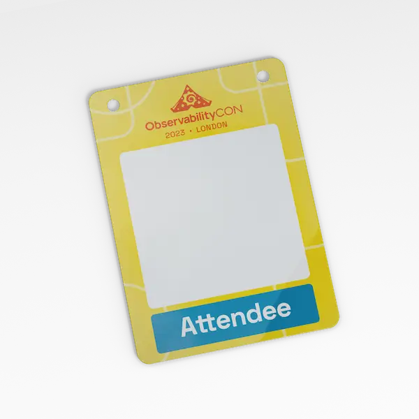
Event branding and logos should be used subtly, as the badge’s primary function is to be an identification tool, not a billboard.
-
Using 3-4 distinct color variants is an effective way to visually distinguish between different attendee groups like speakers, staff, and VIPs.
Event badges often go overlooked. Until someone squints at yours across the room, wondering, “Is it Sarah or Sandra?”. Or worse, until they flip your badge around three times trying to find your company name. Sounds familiar?
When done right, badges identify people, kickstart conversations, support logistics, and make attendees feel they’re in good hands – and in the right place. But what should an event badge include? And how do you avoid the clutter that makes them hard to read?
What should be on an event badge?
The attendee’s name, their company, event name, a logo, maybe? There’s no checklist set in stone. However, we want to show you good practices and seven essential tips concerning event badge design that will make your badges work for every type of event.
1. Keep info minimal and prioritised
What should an event badge include? The golden rule: less is more. The best badges answer a simple question: “Who is this person?”. That’s where the prioritisation comes in.
- 1. The attendee’s name should always be the largest element. It’s what people will scan first in crowded spaces or during professional networking events.
- 2. Directly underneath, you can include their company or title in a medium-sized font — it adds context without competing for attention.
- 3. What about the event name? Yes, it’s nice for branding, but it’s not what people need to see at a glance. Keep it small, ideally tucked into a corner or header. Think of it as the badge’s signature, not its headline.
2. Use font sizes that create visual hierarchy
Want to make your badge easier to read in motion (think walking-and-talking)? Use font sizes with at least a 3-point difference between levels of information.
Here’s a quick example:
- – Name: 36 pt
- – Company/Title: 24 pt
- – Event name: 12–14 pt
This approach helps people read faster and creates a visual rhythm that’s clean and professional. When everything’s the same size, nothing stands out.
3. Give elements breathing room
Cramming every piece of info into a tight square? That’s a recipe for confusion. Design your badge in clear blocks, and leave white space between:
- – The name and company
- – Logos (yours or sponsors’)
- – Any QR codes or extra icons
| White space isn’t wasted space — it gives the eye a break and the brain clarity. You’ll be surprised how much more “premium” your badge looks with a little room to breathe! |
Just take a look at our premium event badges. The clear design is what makes them stand out. Additionally, the strong, glossy laminate on both sides gives a luxurious, high-end feel that genuinely makes a difference.
4. Design for both sides
Badges twist, people move… that’s the reality. The simple fix? Print the same layout on both sides of the badge. That way, even if it flips, the key info is still visible.
And if you need more space, use the front for identification (name, company, colour coding) and the back for secondary content, such as a mini agenda, venue map, or sponsor ads.
5. Make QR Codes helpful, not dominant
QR codes on event badges are ideal for dynamic information, such as schedules that are subject to change or speaker bios that require regular updates. But here’s the key: QRs don’t need to be huge. A small, scannable code in the corner is enough. Save that space for what really matters — human-readable details.
| Tip: Label the QR code with a short cue (“Full schedule here”) so people know what they’re getting. |
6. Use colour coding thoughtfully
Colour is a quick way to visually group people — attendees, speakers, staff, and VIPs — without requiring additional text. But too many colours? That’s just chaos, especially when designing multilingual event badges.
Stick to 3–4 colour variants max. For example:
- – blue = regular attendee
- – red = speaker
- – green = staff
- – yellow = VIP
7. Don’t let branding take over
Yes, the badge is an integral part of your event’s identity. And yes, it’s nice to show off that polished logo. Just remember: your badge is a tool first, not a billboard.
Use your event name or logo subtly — maybe in a corner, header band, or on the lanyard itself. When you keep branding light, you make room for what the attendee really wants: to feel seen, known, and comfortable making connections.
One last tip? Go for more clarity!
So, what should be on an event badge? In short, the minimum needed to identify someone quickly and spark a conversation. That’s it.
If you follow our event badge checklist — minimal content, smart font sizing, clear layout, and some helpful colour cues — your badges will look more polished and work better for everyone. Do you want to make your event badges perfect? Work with us – contact BadgeGo today and see what we can do together!
FAQ
What is the most important information to put on an event badge?
The attendee’s name is the most important information and should be the largest element. The second priority is their company or title, which should be smaller. Event branding, like the event name, should be the smallest.
What is the best way to use fonts on a badge design?
Use a clear visual hierarchy by making the attendee’s name the largest (e.g., 36 pt), their company smaller (e.g., 24 pt), and the event name smallest (e.g., 12-14 pt). This clean layout helps people read the badge faster.
Should I print on both sides of an event badge?
Yes, you should print the same key information, especially the attendee’s name, on both sides. This ensures the badge is always readable, even when it twists or flips. The back can also be used for secondary content like a mini-agenda.